Flutter For Beginners#4- Flutter Layouts

👩💻📚🔍 Hi there! I'm a passionate software developer, constantly exploring the ever-evolving world of technology. With a voracious appetite for knowledge, I'm always diving into books and articles, seeking new insights and expanding my horizons. 💡✨ Curiosity is my driving force, and I'm on a never-ending quest to unravel the mysteries of the digital realm. Join me on this exciting journey as we navigate the realms of code and reach new heights together! 🚀🌟
it’s time to look at Flutter in a bit more detail. There is a Popular saying “In Flutter it’s all about widgets”, Scenes when you start dealing with API’s. So, in direct contravention to the popular saying, Flutter is not, in fact, all about the widgets: there are also APIs. We will look at APIs that Flutter has to offer, later in this series.
In this article we will be discussing about Flutter layout, in Flutter the layouts are also widgets. Flutter layout widgets helps us organize, structure and build the skeleton of our app. Flutter layouts mainly comes down to a grid structure which comprises of Rows and Columns, of which there is a Row Widget and Column Widget. Each one can have one or more children’s, in the case of Row widget its children are laid out horizontally, in the case of Column widget its children are laid out vertically.
Take a look at the code below:
import 'package:flutter/material.dart';

void main() => runApp(MyApp());

class MyApp extends StatelessWidget {

  @override
  Widget build(BuildContext context) {
    return MaterialApp(
      title: 'Flutter Layouts Learning',
      home: Scaffold(

        // Row Widget
        body: Center(
          child: Row(
            children: [
              Text('Text 1'),
              Text('Text 2'),
              Text('Text 3'),
              Text('Text 4')
            ],
          ),
        ),
      ),
    );
  }
}
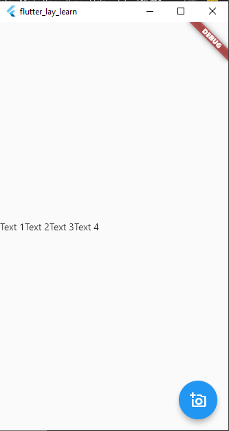
The Image Below Shows The Output Of The Above Code
Much more is going on here beyond the Row and Column widgets, lets break it down. We started by importing the material.dart library, which brings in the Material style widgets. Next, we have a main() function that instantiates the MyApp class and passes the instance to the runApp() function that Flutter provides. That gives Flutter the root-level widget it needs to start running the app. Since for this we do not need any state, MyApp class extends a StatelessWidget, and the required build() method produces a single widget of type MaterialApp. This widget implements under the hood quite a lot for us, so it’s always a good idea to start with it.
The title you see is a property of the MaterialApp widget, and is a single-line string of text that is used by the device to identify the app to the user, the MaterialAppwidget provides quite a few other properties. A few of interest include the color property, which defines the primary color used for the application in the OS’s interface, and theme property which takes as its value a ThemeData widget and which further describes the theme(colors,text e.t.c) used for the app.
The MaterialApp widget also requires a home property, and the value of it must be a widget. Most commonly, you’ll specify a scaffolding widget, it implements the basic layout structure of a screen in your app. Like MaterialApp, the basic Scaffold widget takes care of many common app UI elements for you like the top-level navigation bar, drawers(Menu that slidesout from the side) and bottom sheets (like drawers, but they slide up from the bottom). The Scaffold widget provides a number of properties, including
appBar (which provides an app bar to display at the top of your app),
backgroundColor (your app background)
bottomNavigationBar (which allows your app to have a navigation bar at the bottom)
floatingActionButton (This is the blue Button at the bottom right of our app, which has a child of Icon widget, which enabled us to place an icon inside the FloatingActionButton)
Whichever scaffolding widget you use, it will require a child widget. With the Scaffold widget, you specify that via the body property. Here, I want all my widgets to be vertically centered, so the Center widget is used. This widget will center all its children within itself, but the critical thing is that by default, a Center widget will be as big as possible, meaning it will fill whatever space its parent widget allows. In this case, the parent widget is the Scaffold, which automatically has available the full size of the screen, so essentially the Center widget will fill the entire screen.
The child of the Center is a single Row widget, which means that the Row will be centered within the Center and thus centered on the screen. The Row widget has a property children, which allows us to specify an array of widgets that will be laid out across the Row. Here, four children are defined: three Text widgets. A Text widget displays a string of text in a single style. Some interesting properties that Text supports are overflow, which tells Flutter what to do when the text overflows the bounds of its container (specifying overflow : TextOverflow.ellipsis, for example, causes ... to be appended to the end); textAlign, which lets you determine how text should be aligned horizontally; and textScaleFactor, which tells Flutter the number of font pixels for each logical pixel unit and thereby scale the text.
One thing to notice, if you tried this sample
you HAVE tried this sample, right?!
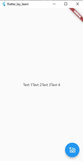
is that all the Text widgets are scrunched up on the left. What if we want them horizontally centered? In that case, we need to tell the Row to center them, and to do that, we add mainAxisAlignment : MainAxisAlignment.center to the Row’s constructor call (it’s just another property, just like children is).
Another widget to note here is the Align widget. Like the Center widget, align is generally used when you have only one child, and it serves a similar purpose to Center but has more flexibility, it aligns its child within itself and can also optionally size itself based on the child’s size. The key to using it is the alignment property.
Lastly, we have the columns widget, everything about the Row widget, also applies to the Columns widget. The difference being that children of Column widget are laid out vertically down the screen. You can off course nest Row widgets within Column’s widgets and vice versa, which will allow you create complex ui structures, and that’s what a great deal of Flutter UI development boils down to.
CONTAINER
Take a look at the code below
import 'package:flutter/material.dart';

void main() => runApp(MyApp());

class MyApp extends StatelessWidget {
  @override
  Widget build(BuildContext context) {
    return MaterialApp(
      title: 'Flutter Layouts Learning',
      home: Scaffold(
        // Row Widget
        body: Center(
          child: Container(
            height: 150.0,
            width: 150.0,
            color: Colors.red,
            child: Center(
              child: Column(
                mainAxisAlignment: MainAxisAlignment.center,
                children: [
                  Text('Text 1'),
                  Text('Text 2'),
                  Text('Text 3'),
                  Text('Text 4')
                ],
              ),
            ),
          ),
        ),

        floatingActionButton: FloatingActionButton(
          onPressed: () {},
          child: Icon(Icons.add_a_photo_outlined),
        ),
      ),
    );
  }
}
And also Take a good look at the image below
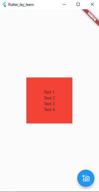
Looking at code directly above the image , considering you already know what a Center, Row and Column widget does and how they behave, you might have an Idea of what happened. Don’t worry if you don’t I will explain in a bit.
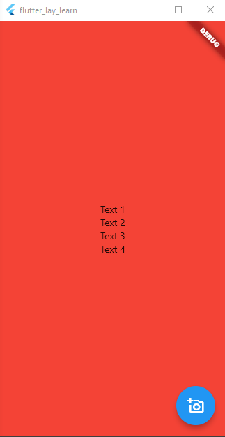
The thing responsible for the red Box is what is called a Container widget in flutter. To explain the code above, all I did was to take up our code change the Row to a Column widget, then take up the centerd Column widget and made it the child of a Container widget, and using the color property of the container widget , I changed the container color to red. Now comes the interesting part, Container widget takes up the Entire space that’s been given to it, by using the height and width property we were able to tell the Container how much space it should occupy, else it would have taken up the entire screen. Take notice of the image below after we removed the height and width property;
The Container widget is, along with Row and Column (and ignoring the application and page-level widgets) probably one of the most-used widgets Flutter offers for laying out your UI. It’s a bit of a jack-of-all-trades in that it combines what a number of other widgets provide into one sleek package. You will see this more in practical when we start building real world apps from scratch, in the second part of this series
Conclusion
And, for the most part, that’s about all there is to Flutter. You learnt about the core flutter layouts which are Rowes and Columns, you also learnt about Containers which allows us manipulate the structure of our App. Yes there are still many flutter layout widgets we didn’t discuss about, like the ListView widget,ScrollView Widget, Box Component Widgets e.t.c, We will discuss them in later articles in this series as we advance. Next up in this series we will discuss Flutter navigation widgets, which allows the user to move to different pages in our app. And that’s it for now, See you in the Next Article


